




What if the most memorable part of a brand isn’t a single image, but the feeling its design creates wherever people encounter it? Creative design can shape that experience across a website, a film, an activation or a printed piece, giving each touchpoint a clear purpose and a place in the same story.
Creative work can feel subjective. A polished visual may catch your eye, but without understanding its purpose, it’s hard to judge whether it speaks to the right audience or supports the wider brand experience. The difference lies in the thinking behind it: how the audience, message and medium guide each design decision.
This article explores five practical examples, looking beyond the finished visuals to what makes each one useful. You’ll see how creative design can work across identity, digital, motion and live experiences, then use a simple framework to assess the work: who it’s for, what it communicates and how the medium brings the idea to life. It’s a practical way to recognise when design is doing more than looking good, and when separate touchpoints come together as a coherent brand experience.
Key Takeaways
- Effective creative design connects audience needs, a clear message and the right medium.
- Look beyond finished visuals to understand the intent behind each brand experience.
- Assess design beyond personal taste by reviewing purpose, audience fit, clarity, consistency and accessibility.
- See how a single idea can take different forms across print, digital and motion touchpoints.
- Learn how strategy, design and production can work together to shape wider brand communication.
What Is Creative Design, and What Makes It More Than Decoration?
Creative design is purposeful problem-solving expressed through visual or sensory communication, shaped to connect an audience with a message in a particular context. It brings intention to choices such as colour, composition, sound, movement and format. A design can be beautiful, striking or playful, but those qualities matter most when they help the communication do its job.
Decoration adds visual interest; purposeful design gives that interest a role. A bright colour might draw attention to an important instruction, for example, while a calm layout could make complex information easier to approach. Aesthetic judgement is part of strategy: it helps set the tone, create recognition and guide attention. Ask whether each choice contributes to the intended experience, rather than simply filling space.
A useful design brief connects four considerations: who needs to receive the communication, what they should understand or feel, where and how they’ll encounter it, and which medium best suits that moment. A message for someone quickly scanning a mobile screen may need a different structure from one in a printed guide or at a live event. Making these points clear gives creative decisions a meaningful direction.
How does creative design differ from graphic design?
Graphic design commonly focuses on visual communication and its execution, using elements such as typography, imagery and layout to convey information. Wikipedia describes graphic design as a profession, academic discipline and applied art that creates visual communications to transmit specific messages and achieve objectives. Creative design is a broader problem-solving approach. It may use graphic design, but can also bring together digital, motion, sound or live experiences to address a communication need.
For example, imagine a community organisation wants to help people find a recycling point. A graphic designer might create a clear poster with directions and collection details. A broader creative approach could also consider how that information should work on a mobile page, in a short animated explainer and on signs at the site. The idea stays recognisable, while each format is designed for its setting.
Why does design need a clear purpose?
Purpose begins with an audience need. If people are unfamiliar with a service, the objective might be to explain it simply. If they already know the basics, the communication may instead help them take a next step. That distinction affects the format, tone and order of information.
For a quick instruction, a concise headline and clear visual hierarchy can make the essential action easier to spot. For a story that needs to build emotional understanding, pacing, imagery or sound may carry more weight. Appearance helps people notice and interpret a message, but it can’t replace the message itself. Ask what the audience should take away and whether the design makes that clear.
How Creative Design Connects Audience, Message and Medium
A strong idea is only a starting point. To work as communication, the design needs to suit the people it’s for, the message they need and the situation in which they’ll encounter it. A clear process helps teams make considered choices without closing off creative exploration.
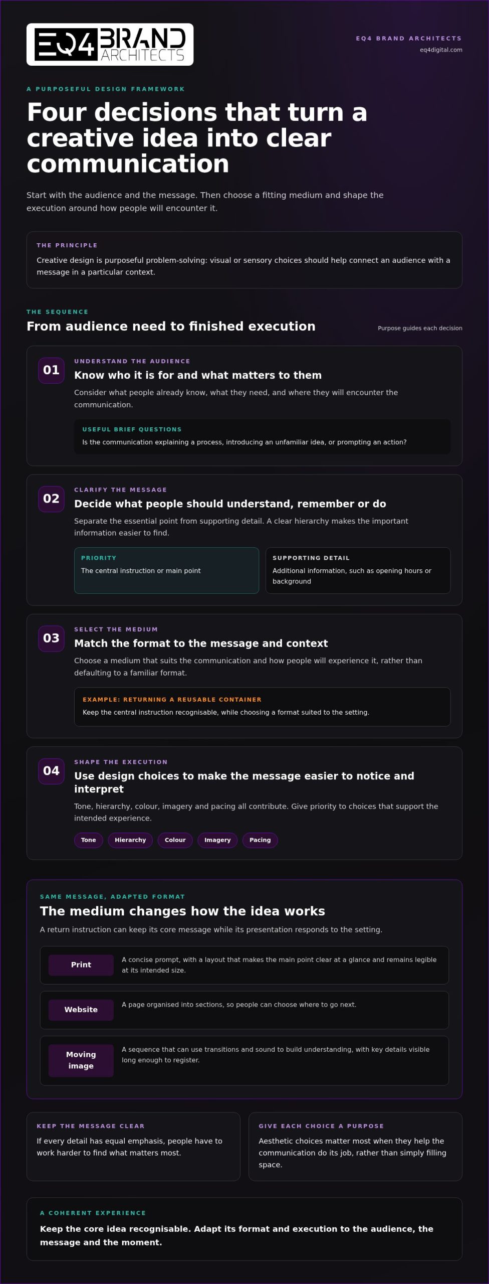
Purpose guides creative decisions by showing what the audience needs to understand or do, then shaping the message and medium to support that response. A useful sequence is:
- Understand the audience. Consider what they already know, what matters to them and where they’ll encounter the communication.
- Clarify the message. Decide what people should understand, remember or do. Separate the essential point from supporting detail.
- Select the medium. Choose a format that fits the message and context, rather than defaulting to one simply because it’s familiar.
- Shape the execution. Use tone, hierarchy, colour, imagery and pacing to make the message easier to notice and interpret.
What should a designer understand before developing an idea?
Before sketching concepts, establish the audience, the setting and the intended response. Is the communication meant to explain a process, introduce an unfamiliar idea or prompt an action? A focused brief makes those needs explicit, identifies essential information and gives the creative team useful boundaries. It doesn’t prescribe the final look. Instead, it gives exploration a meaningful direction and a shared basis for evaluating options.
For instance, imagine a brand needs to explain how customers can return a reusable container. The central instruction must be easy to find; opening hours or background information may be secondary. If everything receives equal emphasis, readers have to work harder to identify the next step. A clear hierarchy gives priority to what matters most.
How does the medium shape the creative execution?
A printed notice is static, so its layout needs to establish the main point at a glance and remain legible at its intended size. A website can organise information into sections, allowing people to choose where to go next. A moving image unfolds over time: sequence, transitions and sound can build understanding, but key details need to remain visible long enough to register.
The same return instruction might become a concise printed prompt, a web page with clear steps or a short animation showing the process. Each version should preserve the core message while responding to how people will encounter it. A lively tone can make an invitation feel approachable; too many competing colours or images may distract from the action. Consistent visual choices across touchpoints can help the experience feel connected, much like a considered visual branding system.
When a project spans formats, aligning communication strategy with design and production helps keep the central idea coherent as its expression changes. EQ4 brings these disciplines together through integrated brand communication, connecting creative thinking with design and production capabilities.
Five Illustrative Creative Design Examples Across Brand Touchpoints
These five hypothetical scenarios show how a design choice can serve an audience need, carry a message and fit its medium. Together, they demonstrate how creative design can create a coherent experience without making every touchpoint look or behave identically.
1. Identity: making a new service recognisable
Example: A repair service wants people to recognise its communications and understand what it does. A simple graphic identity uses a distinctive symbol, a clear type style and a consistent colour palette across a leaflet, staff badge and sign. The audience need is quick recognition; the design choice is a repeatable visual system; the media are printed materials. This makes separate encounters feel related while keeping essential service information easy to find.
2. Campaign: extending one message across formats
Example: A community initiative wants people to reduce household food waste. Its campaign centres on one practical message, then adapts it into a poster, a social post and a short email. The audience needs an approachable reminder, so each execution uses the same central phrase and visual cue, with details adjusted to fit the format. Repetition builds recognition; variation keeps each version suited to its setting rather than reproducing one layout everywhere.
3. Activation: turning attention into participation
Example: An organisation invites visitors to make a small sustainability pledge at a public event. A simple interactive station asks each visitor to choose one action and add it to a shared display. The audience need is an accessible way to participate; the creative choice is a direct, low-friction interaction; the medium is a live activation. It makes the invitation tangible and gives the message a social setting, without assuming what visitors will do afterwards.
4. Website: helping visitors find the next step
Example: A training provider needs prospective learners to understand its courses and find application information. A website gives course details a clear hierarchy: a concise introduction, distinct course sections and a visible route to application guidance. The audience needs to compare information at their own pace; the medium lets them explore sections as needed. The design’s role is to make important content findable, not to make every item compete for attention.
5. Motion-led storytelling: making a process easier to follow
Example: A public service wants to explain how to prepare documents before an appointment. A short animation presents the steps in sequence, using movement to show what happens next and on-screen text to reinforce key details. The audience needs a clear explanation; the medium is moving image. Pacing and sound can support the story, while unnecessary movement may distract from the instruction.
Across these examples, the central idea stays connected to the audience’s need, but its expression changes with the touchpoint. A considered system makes the choices feel related, from identity to production, while allowing each execution to do its own job. This strategic thread can carry a brand idea from planning into public experience.
How to Evaluate Creative Design Without Relying on Personal Taste
A design review can become subjective quickly. One person prefers a quieter colour palette; another wants a bolder headline. Those reactions can be useful, but they don’t show whether the work is doing its job. Start with the brief and intended audience, then assess the design against its communication purpose.
Personal taste describes what you like; purposeful evaluation asks whether the design serves its audience and objective. Use this five-point review:
- Purpose: Does the design support a clearly stated communication objective, such as explaining an idea or helping people find a next step?
- Audience fit: Does the tone and presentation suit the people it needs to reach and the context in which they’ll see it?
- Message clarity: Can someone identify the central point without working through competing details?
- Consistency: Do the visual choices connect with the wider brand and other related touchpoints?
- Accessibility: Is important information legible and understandable, with sufficient contrast and a clear structure?
This framework doesn’t require everyone to share the same aesthetic preference. It gives a team shared criteria for discussing whether a choice is relevant, clear and useful. It also helps distinguish a communication problem from a personal reaction to a particular colour, typeface or image.
What questions reveal whether a design communicates clearly?
Review the work in its intended context, not only on a presentation screen. Ask what the audience should notice first, whether the central message is understandable and whether the order of information supports that reading. Consider whether the tone and imagery suit the audience. If a key instruction is hard to find, describe what is drawing attention instead. That observation is more useful than simply saying the layout feels wrong.
How can feedback make creative work more useful?
Anchor comments to the objective and a specific design decision. For example, “The application step is difficult to spot beneath the introduction” identifies an issue the team can address. “Make it pop” expresses a reaction but gives no clear direction. If feedback reflects an assumption about audience response, explain the assumption and what prompted it. This keeps discussion open to creative solutions while giving revisions a practical focus.
Thoughtful evaluation is part of building a meaningful brand identity: decisions across different materials should support a recognisable and coherent expression. For a considered approach to design and communication, EQ4 provides creative design services.
How EQ4 Brings Creative Design into Wider Brand Communication
Creative design has greater coherence when it grows from a clear understanding of what a brand needs to communicate. EQ4 Brand Architects combines emotional intelligence with intentional communication strategy, considering both the message and the people who need to connect with it. This keeps creative direction purposeful, rather than treating a visual execution as an isolated asset.
EQ4’s capabilities include graphic design, web design, animation, visual effects (VFX), video production and sound design. Each discipline offers a different way to express an idea: a visual identity can establish recognition, a website can organise information, and motion or sound can shape how a story unfolds. The right combination depends on the brief, audience and touchpoints involved.
Why connect creative direction with production?
Considering execution early helps a team explore how an idea might translate across formats. A design concept intended for print, a website and an animated film may need adjustments to layout, pacing or detail to work well in each setting. Discussing those needs from the outset gives creative direction and production a shared reference point.
For example, a colour treatment that works in a static layout may need careful adaptation when elements move on screen. Sound can add another layer to a film, while a web experience calls for choices suited to how visitors engage with its content. Aligning design, motion, sound and digital output with the brief helps keep the central idea in view as its expression changes. It connects disciplines without promising a particular campaign result.
When might a brand benefit from a strategic creative partner?
A strategic creative partner can be useful when a brand has a new communication need, is planning work across several formats or wants to refresh how its experience feels. These projects often raise connected questions: what should the message convey, which touchpoints matter, and how can each execution feel part of the same story?
EQ4 brings creative and strategic communication capabilities together, so these questions can inform the work. Graphic design, web design, animation, VFX and production can be considered alongside communication strategy, keeping creative direction and execution connected to the brief. Collaboration also gives different disciplines an opportunity to contribute their perspective as the work takes shape.
EQ4’s creative and design capabilities bring strategy, design and production together to support brand communication.
Give Your Next Brand Idea a Clear Direction
Your next communication challenge is an opportunity to decide not only what your brand wants to say, but how people should experience that message. Let that intention guide the brief, invite fresh thinking and give each creative decision a reason to be there. That’s where creative design can become more than a visual treatment: it can help shape a considered relationship between a brand and its audience.
EQ4 brings creative and strategic communication together, with capabilities spanning design, digital, animation, visual effects and production. These disciplines can contribute to an idea from its direction through to its expression across relevant touchpoints.
Whether you’re shaping a new communication need or considering how existing brand experiences could feel more connected, start with a clear brief: define the audience, the message and the touchpoints that matter. Explore EQ4’s creative and design capabilities to discuss your brand communication needs.
Frequently Asked Questions
What is creative design in simple terms?
Creative design is the process of making communication choices to address an audience or brand need. In simple terms, it turns an intention into something people can see, hear or interact with. For instance, a public service explaining a new appointment process might use a visual guide alongside an audio explanation. The useful question is whether the chosen form helps people understand the idea, not simply whether it looks polished.
How is creative design different from graphic design?
Graphic design focuses on visual communication, often using typography, layout and imagery. Creative design can begin with a broader question: what needs to be communicated, and what forms might best serve that purpose? For a hypothetical museum exhibition, graphic design could shape labels and maps, while the wider creative approach might also consider visitor signage or an audio introduction. The disciplines overlap, but their scope can differ.
Can creative design help a brand communicate more clearly?
Yes. Creative design can make a brand’s communication easier to understand by giving information a considered structure and tone. Imagine a company explaining a change to its return process: a concise diagram could show the steps, while a longer written guide covers exceptions. Each format has a distinct role. Clarity comes from matching the treatment to what people need to know, rather than adding visual detail for its own sake.
What are examples of creative design in marketing?
Marketing examples include a product launch identity carried through packaging and retail displays, an event experience that invites visitors to engage with a message, or an explainer film introducing a service. A campaign might also pair public relations materials with digital content, adapting the central idea for different audiences. The formats vary, but each should have a defined role, such as introducing an offer or helping people understand its value.
How do you evaluate whether a creative design is effective?
Check whether people in the intended audience can explain what the communication is about and what they’re meant to do next. A practical review is to show the work in its intended format, then ask a few relevant questions without first explaining the concept. If responses reveal confusion, identify the specific point causing it and compare that with the brief. This gives revisions a useful starting point instead of relying on preference alone.
Does creative design include web design, animation and video?
It can. Creative design is an approach to solving communication needs, and the execution may involve digital or moving-image formats as well as static visuals. EQ4’s capabilities include web design, animation, video production, visual effects and sound design. These disciplines can contribute different elements to a brand communication project, with the combination shaped by its purpose and creative direction.
How does creative design support a consistent brand identity?
It helps a brand establish recognisable cues, such as a consistent typographic style, image treatment or way of speaking, that can be adapted to different contexts. A practical tool is a brand guide that sets out those principles and shows how they apply to common materials. This gives teams room to create fresh executions while maintaining a recognisable identity, rather than making every touchpoint identical.