





What if your logo is recognisable, but the rest of your brand feels like it belongs to someone else? Visual branding is more than a mark or a set of attractive colours. It’s the visual language that helps people recognise your brand and understand what it stands for wherever they encounter it.
If you’re unsure how visual branding differs from a logo or a broader brand identity, you’re not alone. The challenge is turning a brand’s character into design choices that feel distinctive and work together, rather than collecting elements that look good in isolation. A clear system can bring consistency to every interaction, from a website or presentation to animation and video.
This article explains the components and purpose of visual branding, and how to connect design decisions to your audience, positioning and brand meaning. You’ll also find practical ways to build an adaptable system, so your brand can express itself consistently across real-world touchpoints without looking exactly the same everywhere.
Key Takeaways
- See how visual branding goes beyond a logo to create recognition and communicate what a brand stands for.
- Understand how colour, typography and imagery work together as a connected visual toolkit.
- Learn to shape visual choices around audience, positioning and context, then apply them consistently across touchpoints.
- Use practical steps to turn brand principles into clear visual rules before creating assets.
- Discover how to refresh a visual system thoughtfully, refining what needs to change while protecting recognisable elements.
What Is Visual Branding, and What Does It Help a Brand Do?
A logo may catch someone’s eye, but it can’t carry a brand’s whole story on its own. Visual branding is a connected system of intentional visual choices that makes a brand’s strategy visible and recognisable. It brings elements such as colour, typography, imagery and composition together to shape how a brand appears across communications and customer touchpoints.
These cues help people identify a brand and form an impression of its character. A distinctive colour palette, for instance, may help an audience recognise a social post before reading its name. A consistent photographic style can suggest whether a brand feels warm, formal or energetic. People interpret these signals through context and personal experience, so design can guide meaning without controlling exactly how everyone responds.
Visual branding is connected to, but distinct from, both brand identity and brand strategy. Strategy clarifies a brand’s purpose, audience and positioning: what it wants to communicate and why. Brand identity expresses that thinking through verbal and visual choices. Visual branding focuses on how the visual elements work together and appear in use. The idea of visual brand language offers a useful way to consider how coordinated design cues contribute to a recognisable brand experience.
This distinction matters because the goal isn’t simply to make each item attractive. Every design decision should have a reason: it might help the brand feel more accessible to a particular audience, express a considered point of difference or make information easier to navigate. Communication strategy and creative direction connect these intentions to practical visual choices, rather than treating design as decoration added at the end.
How Is Visual Branding Different from a Logo?
A logo is a recognisable signature, not the whole visual identity. Imagine a neighbourhood café whose logo uses a simple line drawing of a cup. If its menus, website and social posts use unrelated typefaces, colours and layouts, the logo may be familiar, but the overall experience can still feel disconnected.
A broader system gives that logo a consistent setting. Typography establishes tone and hierarchy; colour creates recurring visual cues; imagery sets a mood; and composition determines how these elements are arranged. Together, they help the brand remain recognisable even when the logo is small, absent or adapted for a particular format.
Why Does a Coherent Visual Identity Matter?
People encounter brands in different places and at different times. Repeating considered visual patterns can help them connect those encounters, whether they see a website, presentation or campaign asset. Coherence doesn’t mean making every piece identical; it means giving each one a recognisable relationship to the same brand.
When visual choices align with a brand’s intended character and positioning, they can help communicate what it wants to be known for. A clear, approachable brand might use open layouts and legible typography, while a more expressive one could make bolder use of imagery. These choices support communication, but they don’t guarantee trust or sales on their own.
Which Elements Make Up a Visual Branding System?
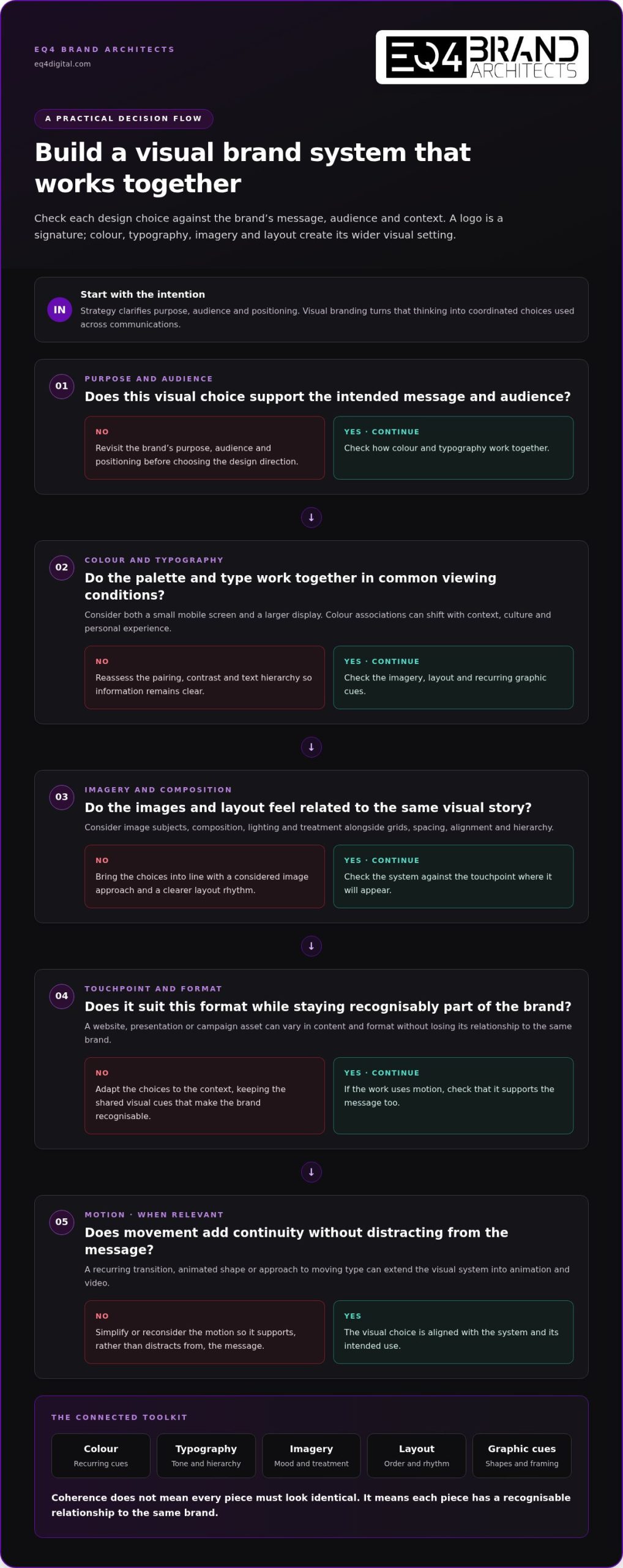
A visual branding system is a connected toolkit, not a collection of isolated design trends. Its elements work together to express a brand’s character and help communications feel related, whether they appear on a website, in a presentation or within a campaign. Colour, typography, imagery, graphic forms and layout each have a role, guided by the same strategic intent.
Think of the system as a set of choices with shared logic. A palette should suit the brand’s intended tone; type should make messages clear and establish a useful hierarchy; image treatments and layouts should support both. Making these decisions as a whole makes them easier to apply consistently across formats.
How Do Colour and Typography Shape Brand Expression?
Colour can attract attention, separate information and help create a recognisable impression. Its associations aren’t universal, though: interpretation can shift with context, culture and personal experience. Choose colours for how they support the brand’s message and audience, rather than assuming a shade will produce a particular response.
Typography brings a different set of cues. Letterforms contribute tone, while size, weight and spacing create hierarchy, helping readers distinguish a headline from supporting information. Assess colour and type together in common viewing conditions, including on a small mobile screen and a larger display. A palette that feels balanced on one screen may lose contrast when paired with certain text styles.
What Roles Do Imagery, Layout and Graphic Devices Play?
Images shape the atmosphere of a brand’s communications through their subjects, composition, lighting and treatment. A consistent approach, such as candid people-focused photography or clean product illustrations, can make different pieces feel as if they belong to the same story. The aim isn’t to use identical images, but to make considered choices that suit the brand.
Layout organises those choices for the audience. Grids, spacing and alignment create rhythm, while hierarchy makes it easier to see what matters first. Recurring graphic devices, such as a particular shape, line style or framing treatment, can connect materials that use different content or formats.
Motion can extend the system into animation, video and other screen-based communications. A recurring transition, animated shape or approach to moving type can add continuity, provided it supports the message rather than distracting from it. The same principle applies to visual effects: techniques should fit the brand’s creative direction.
Consistent design rules make separate assets feel related without requiring every asset to look the same. Useful rules explain how elements work in practice: which type styles signal hierarchy, how images are selected and cropped, and where graphic devices can appear. Communication strategy and creative direction help connect those rules to what a brand needs to express.
For a closer look at how strategy and design can inform expression across formats, explore EQ4 Brand Architects’ creative approach.
How Does Visual Branding Communicate Meaning Across Touchpoints?
A visual cue doesn’t carry a fixed message in every situation. Audiences interpret it through the context in which they see it, their familiarity with the brand and their own experiences. A formal typeface may suggest expertise to one person but feel distant to another. Visual branding communicates most clearly when design choices are intentional, relevant to the audience and supported by the surrounding message.
Consistency helps people connect separate encounters, but placing the same logo on every item isn’t enough. If a company’s website feels calm and considered while its presentation uses crowded layouts and unrelated imagery, the logo can’t make those experiences feel coherent. Shared rules should be recognisable, with enough flexibility for each channel to work well.
What Does Consistency Look Like Across Different Channels?
Imagine a professional services brand communicating a clear, approachable character. Its website, presentation and social post don’t need identical layouts. They can use related type styles, image treatments, spacing and graphic details, then adapt those elements to suit each format.
Website
Coherent: clear headings, generous spacing and a consistent image style. Inconsistent: unrelated type styles and visual treatments across pages.
Presentation
Coherent: the same hierarchy and graphic language, arranged for slide-by-slide reading. Inconsistent: crowded slides that ignore the brand’s established layout principles.
Social post
Coherent: a concise message using familiar type, colour and image rules. Inconsistent: a new visual style that feels disconnected from the website and presentation.
The practical test is whether the design feels recognisably part of the same brand while still serving its purpose. A presentation needs to support a spoken story; a social post must communicate quickly; a website should help people find their way. Consistency lives in the principles, not in copying one layout everywhere.
How Can Visual Choices Be Clear and Inclusive?
Clarity and inclusion are part of responsible visual communication. Review designs at the size and in the setting where people will encounter them, rather than judging only a polished mock-up. A simple check can reveal whether:
- Text and background colours have enough contrast for comfortable reading.
- Type remains legible at smaller sizes and information hierarchy is easy to follow.
- Essential meaning is communicated with words, labels or shapes as well as colour.
- Images represent people thoughtfully, without relying on narrow assumptions or token gestures.
Colour alone shouldn’t signal that information is correct, urgent or unavailable, since some people may not distinguish the shades and others may interpret them differently. Pair colour with a label, icon or clear wording. Images and symbols can also carry cultural associations that aren’t universal. Invite relevant audiences to review the work, listen to how they interpret it and refine choices where the meaning doesn’t land as intended. That feedback helps a brand express itself with greater care across different contexts.
How Can You Build and Apply a Visual Branding System?
A useful system begins with direction, not decoration. Before choosing colours or typefaces, clarify who the brand needs to reach, what it wants to be known for and how it should feel in people’s minds. Those answers turn visual branding into a practical framework for decisions, rather than a set of assets that look appealing but lack a shared purpose.
How Do You Translate Brand Strategy into Design Principles?
Move from strategic understanding to observable rules in a few deliberate stages:
- Define the audience and positioning. Identify the people the brand is speaking to, the space it aims to occupy and the qualities it wants to express.
- Describe the intended character. Choose meaningful attributes, such as thoughtful, energetic or dependable, and clarify what each should look like in practice.
- Set visual criteria. Translate those attributes into guidance for colour, typography, imagery, composition and motion. For example, “approachable” might mean plain-language headings and open layouts, rather than simply a brighter palette.
- Record the rules. Explain how elements work together, where they can flex and what should remain recognisable. This gives designers and teams a shared reference before assets are produced.
These principles should guide creative design choices, not restrict them to one fixed template. A brand may need to feel expressive in a campaign and clear in a service document; the visual language can adapt while keeping its underlying character. For further perspective on aligning design with brand meaning, explore this guide to branding and design for meaningful brand identity.
EQ4 brings communication strategy together with creative direction and design, connecting what a brand needs to say with how that message takes shape. This link keeps visual decisions grounded in audience and positioning, rather than personal preference alone.
How Do You Test Whether the System Works in Practice?
Before treating the rules as final, apply them to representative materials. Use real content, not only polished sample headlines: a long heading, a detailed presentation slide and a short social message can reveal different strengths and gaps. View the work on smaller and larger screens, and consider how the system translates to print, animation or video if those formats are part of the brand’s communications.
Review each example against practical questions:
- Can people recognise a shared visual character without relying only on the logo?
- Does the hierarchy make the main message easy to find?
- Are type and colour legible, with essential information conveyed in more than one way?
- Can the rules accommodate different content and formats without losing their intent?
Invite relevant users and people involved in producing the materials to review the examples. Ask what they notice first, what feels unclear and whether the brand’s intended character comes through. Treat feedback as evidence for refinement, not a vote on personal taste. Adjust the rules where the work is difficult to use or the message is being misread.
See how EQ4’s creative and design approach can bring strategy and production together across brand communications.
How Should Visual Branding Evolve Without Losing Recognition?
A visual system needs attention as a brand’s audience, channels and priorities shift. New formats may expose gaps in older guidelines, while business changes can make established visual cues less relevant to the brand’s direction. Regular review helps identify what still serves the brand and what needs to adapt. Change for its own sake, however, can unsettle the familiarity the system has built.
When Should a Brand Refresh Its Visual Identity?
Look for practical signals: materials are being adapted inconsistently, existing assets don’t work well in current channels, or the brand’s positioning has moved on. Gather examples from real communications and consider where the system supports the intended message and where it gets in the way. A refresh should address a recognisable need, not simply follow a passing aesthetic preference.
The scale of change should match the underlying issue. A targeted refinement can update a type style, improve a colour combination or clarify image guidance while retaining familiar elements. A larger redesign may be appropriate when the brand’s strategy or character has changed substantially, leaving the existing identity unable to express it. Neither route is automatically better; the right choice depends on what needs to change and what still holds meaning for the audience.
Targeted refinement
Best suited to specific issues in application or legibility. It preserves the recognisable foundations and adjusts selected details.
Larger identity redesign
Better suited to a deeper change in positioning or brand character. It can reshape the visual system more broadly, with careful attention to the elements audiences already recognise.
Before choosing, review audience feedback, the range of materials in use and the brand’s current communication priorities. This evidence-led approach makes it easier to explain why a change is needed and protect valuable recognition as the system develops.
How Can Teams Keep Visual Branding Coherent Over Time?
A guide is useful when people can apply it, not just admire it. Keep guidelines and approved assets in an accessible shared location, and show how the rules work through examples such as a web page, a presentation, a social post and a moving asset. Include preferred applications and clear boundaries, so teams understand where creative choices can flex without losing the brand’s character.
Assign responsibility for maintaining those materials. A named owner or team can review new work, update outdated files and make sure changes to the system are reflected in the guidance. This doesn’t mean every creative decision needs to be controlled centrally. Clear principles give teams room to make thoughtful choices while reducing accidental drift between communications.
Coherent visual expression supports wider brand communication and reputation by helping people encounter a more connected experience over time. It works alongside what the brand says and does; it can’t substitute for those actions. A considered review can keep design aligned with the organisation’s direction while preserving cues audiences know.
If your visual system is ready for a thoughtful review, EQ4 can help shape purposeful design and communication around what your brand needs to express.
Give Your Brand a Clearer Visual Direction
Your next step doesn’t have to be a complete redesign. Start by choosing one place where your brand’s expression feels unclear, then consider what you want people to notice, understand or remember there. A focused review can reveal whether the issue lies in the design itself, the way it’s being applied or the connection between the visual choices and the message.
That’s where visual branding becomes a practical tool for purposeful communication: it helps turn intention into creative decisions people can recognise across the ways they encounter your brand. EQ4 brings communication strategy and creative direction together, supported by capabilities spanning graphic design, web design, animation, visual effects and production.
Ready to shape a more intentional visual direction? Explore EQ4’s approach to intentional brand design and start a conversation about a coherent, distinctive visual system for your brand.
Frequently Asked Questions
Can a business use stock imagery in its visual branding?
Yes, stock imagery can work if it feels relevant and is used with care. Choose images that reflect the brand’s subject matter and intended tone, rather than selecting only for convenience. Before use, review the image licence for permitted channels, edits and attribution requirements. Keep a record of image sources and licence details, and avoid using the same widely circulated image in ways that make the brand feel generic.
How should visual branding work for a business serving multilingual audiences?
Build language needs into the design process, rather than treating translated copy as a last-minute addition. Check that fonts support the characters and accents required, and allow layouts to accommodate different text lengths without shrinking type until it becomes difficult to read. Keep language choices clear and consistent across materials, and use local audience feedback to catch imagery or symbols that may carry unintended meanings.
What should a team check before publishing a branded visual asset?
Use a final review to catch both communication and production issues. Confirm that the correct, current files are being used, names and details are accurate, and the design suits its intended placement. Check small-screen crops, text legibility, contrast and any links or calls to action. For animation or video, review the full sequence with sound and without it, so essential meaning isn’t lost when muted.
Does visual branding need to look identical in every format?
No. A system should make a brand recognisable, not force every format into the same composition. A square social tile, a presentation slide and a long web page have different jobs and proportions. Adapt the layout to each one while keeping the visual decisions that make the work feel connected. A useful test is whether the asset still feels appropriate to its channel and recognisable as part of the same brand.
How can a start-up develop visual branding with limited audience research?
Start with what’s available: conversations with prospective customers, questions raised during sales discussions and patterns in relevant customer feedback. Separate confirmed observations from assumptions, then use those assumptions to guide an initial direction rather than treating them as facts. Test a small set of applications with people who resemble the intended audience. Keep a record of what they understand and what needs revisiting as the business learns more.
How can a business assess whether its visual branding is distinctive?
Compare your materials with communications from brands competing for the same audience. Look for visual habits that appear repeatedly across the category, then identify which of your choices communicate a genuinely relevant point of difference. You can also show people an asset without its name and ask what qualities they notice and what they remember afterwards. Distinctiveness should come from purposeful choices, not difference for its own sake.