





A memorable logo can earn a second glance, but it can’t explain why a brand matters. Branding and design work best together: strategy gives creative choices their purpose, whilst design makes that purpose visible and felt.
If your visuals feel disconnected across a website, campaign or social post, the issue may be more than colour or layout. A brand identity needs to speak to its intended audience and reflect what the organisation stands for. Attractive design matters, but without a clear foundation, it can struggle to create recognition or meaning. Connecting creative decisions with audience needs is more useful than treating identity as decoration.
This article explores how branding differs from design, and how the two shape a distinctive, consistent identity. You’ll learn how audience insight and business purpose can guide decisions about typography, imagery, motion and sound, whilst leaving room for a brand to adapt across formats. EQ4 Brand Architects brings communication strategy and creative disciplines together so ideas can travel coherently across different touchpoints. The aim is not simply to look consistent, but to make every expression of the brand feel considered, relevant and recognisable.
Key Takeaways
- Separate the meaning and experience your brand creates from the design choices that express it.
- Use audience insight and organisational purpose to guide creative direction, rather than relying on a formula.
- Assess branding and design across real touchpoints by checking clarity, recognisability, audience fit and consistency.
- Look beyond visual polish: intentional choices should help people understand what your brand stands for.
- Explore how strategy and connected creative disciplines can help a brand identity adapt across different formats.
What do branding and design mean for a business?
Branding shapes the meaning and experience people associate with an organisation. Design gives that meaning deliberate expression through choices people can see, hear and interact with. Together, branding and design connect what a business intends to communicate with what its audiences actually encounter, from a first impression to a familiar customer interaction.
Those choices need to fit both the people a business wants to reach and the reason it exists. A community organisation, for instance, may need to express approachability and shared purpose, whilst a specialist firm might need to convey clarity and expertise. The right visual direction depends on that context, not on a style that simply looks fashionable.
Branding defines the meaning a business wants to create; design makes that meaning tangible across its experiences.
How is branding different from design?
Branding includes the decisions and associations that shape how people understand an organisation: its purpose, position, character and the expectations it sets. Design is the intentional selection and arrangement of visual and sensory elements that communicate those decisions. Graphic design, for example, uses visual communication to organise and express ideas, but the strategic meaning behind those ideas comes from the brand.
Imagine a food business that wants to feel warm, generous and rooted in familiar traditions. A polished identity with stark layouts and clinical imagery might look elegant, yet suggest exclusivity or distance. The design could be skilful, but the message would be misaligned. Audience expectations and business purpose help determine whether a creative choice communicates the intended idea.
Why does a recognisable brand need more than a logo?
A logo is a useful identifier, but it’s only one asset within a broader identity. Colour, typography, imagery, layout and tone also shape how a brand feels and how its messages are understood. In a presentation, for example, a clear typographic hierarchy can make information easier to follow, whilst consistent imagery can reinforce the character established elsewhere.
Recognition grows through purposeful choices repeated across encounters, not through placing a logo on every surface. Each element should contribute to a coherent impression while remaining useful in its setting. A social post may call for a concise message; a website may need more space to explain an organisation’s offer. The formats differ, but the underlying identity should still feel related.
Distinctiveness doesn’t require novelty for its own sake. Ask whether each choice helps the intended audience recognise the organisation, understand its message or experience its character. If an unusual typeface or colour makes communication harder without adding relevant meaning, it may be decoration rather than a useful expression of the brand.
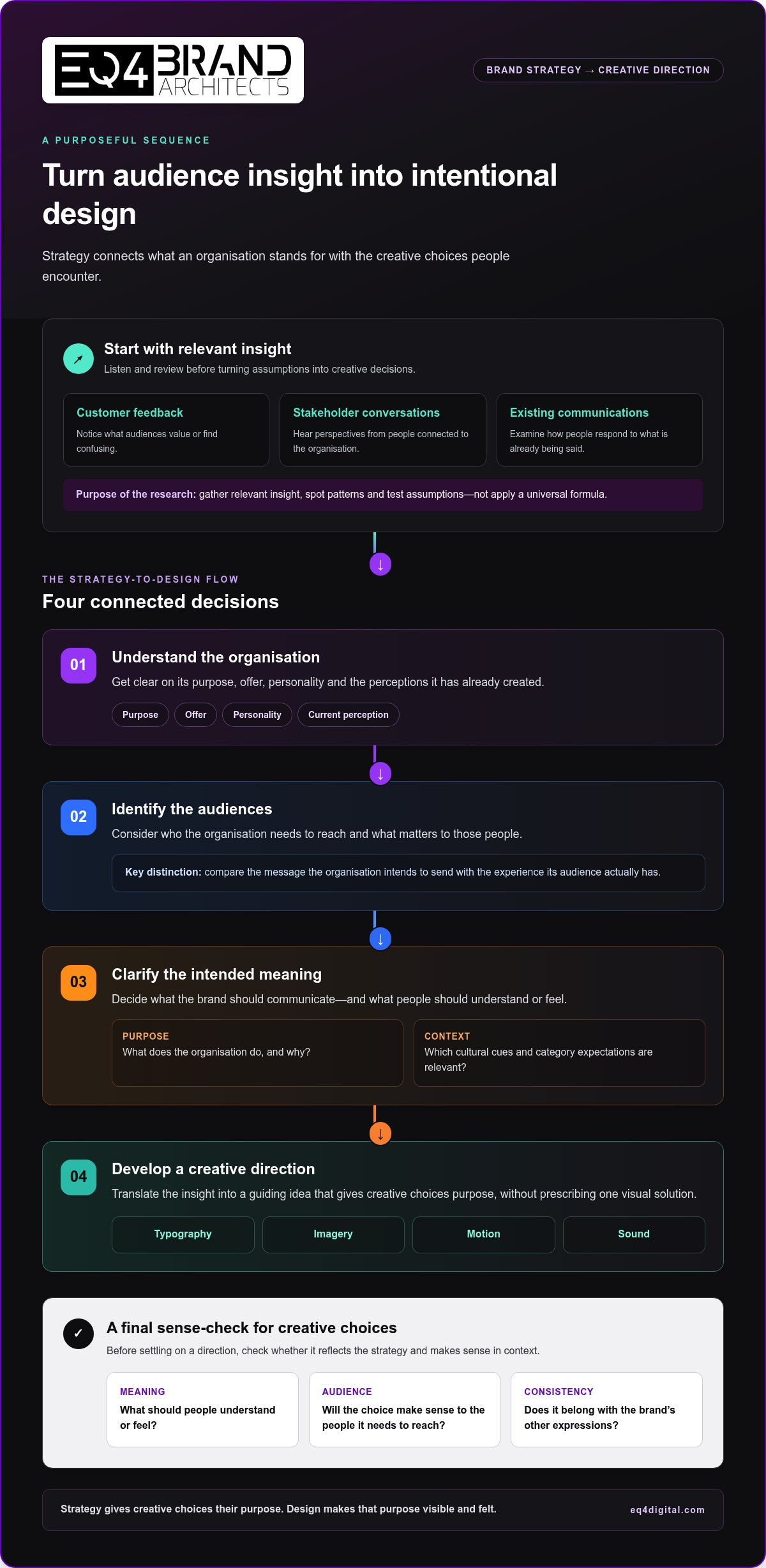
- Meaning: What should people understand or feel?
- Audience: Will the choice make sense to the people it needs to reach?
- Consistency: Does it belong with the brand’s other expressions?
These questions create a practical starting point for distinguishing an attractive identity from a purposeful one. The goal is not identical execution everywhere, but a recognisable idea expressed with care in each context.
How does strategy shape effective branding and design?
Effective creative work starts before decisions about colour, type or imagery. A clear sequence keeps those choices connected to a real purpose: understand the organisation, identify the audiences it needs to reach, clarify the meaning it wants to convey, then develop a creative direction. Each step gives designers useful boundaries without prescribing a single visual solution.
Research and listening can reveal what audiences value, what they find confusing and how they currently perceive an organisation. This might involve reviewing customer feedback, speaking with stakeholders or examining how people respond to existing communications. The aim isn’t to apply a universal formula. It’s to gather relevant insight, notice patterns and test assumptions before turning them into creative decisions.
What should a brand understand before designing?
Begin with the organisation itself: its purpose, offer, personality and the perceptions it has already created. Then consider who it needs to reach and what matters to those people. These questions help distinguish an intended message from the audience’s actual experience, which may reveal a gap worth addressing.
Context matters, too. Cultural references and category conventions can offer useful clues, but they shouldn’t become stereotypes or templates to copy. A financial organisation aiming to feel accessible, for instance, might explore how to make complex information feel clear and human, rather than defaulting to familiar corporate imagery. A review of corporate reputation management can also help show how consistent communication contributes to the way people understand and trust an organisation.
- Purpose: What does the organisation do, and why?
- Audience: Who needs to understand or experience its communications?
- Perception: What do people currently associate with it?
- Context: Which cultural cues and category expectations are relevant?
How does creative direction turn strategy into design?
Creative direction translates these insights into a guiding idea, then gives the team a coherent visual route to explore. If the priority is making a complex service feel clear and approachable, the direction might favour plain language, calm imagery and an orderly layout. Those choices aren’t automatic rules; they’re hypotheses to refine against the audience, message and medium.
Design details help carry the idea. Hierarchy can make the most important information easier to find. Imagery can set a tone or add context, whilst typography can support readability and character. Together, these choices help people understand what matters instead of competing for attention.
Design decisions should express a defined brand idea, not simply decorate a page. This principle leaves space for creative exploration: several concepts may express the same strategic intention, and testing them against audience needs can help reveal which feels clearest and most appropriate.
Design can also clarify complex services at an organisational scale. National Design Studio’s approach to government design offers a relevant example of design applied to public-facing digital experiences, where clarity and usability matter. EQ4 brings communication strategy and creative direction together through brand and creative work that connects an intended idea with its expression across different formats. For a closer look at how strategy, visual design and finished campaign assets can be coordinated, explore this guide to a brand design and production agency in South Africa.
Is branding and design just about looking good?
Visual polish can earn attention, but it can’t establish a clear or credible brand on its own. Effective branding and design should help the right people understand what an organisation offers, what it stands for and why its communication deserves their attention. A beautiful execution that obscures the message is still a missed opportunity.
Consider a health practice that wants to feel reassuring and easy to approach. A dramatic, fashion-led identity might look striking, yet leave people unsure whether the practice is accessible or suited to their needs. The question isn’t simply whether the design is attractive; it’s whether its choices serve a communication purpose.
How can a design be attractive but strategically weak?
A fashionable style can make an organisation look current whilst drawing attention away from its purpose. Copying familiar category cues may help people recognise the type of business, but if every competitor uses the same colours, imagery and tone, the identity may offer little meaningful distinction. Personal preference matters, but it shouldn’t outweigh audience relevance, clarity and the message a design needs to carry.
Use this comparison to assess whether a choice is merely pleasing or genuinely useful:
| Looks good | Works for the brand |
|---|---|
| Uses a fashionable colour because it feels fresh. | Chooses colour to support the intended mood and remain legible in context. |
| Selects striking imagery for its visual impact alone. | Uses imagery that helps the intended audience understand the offer or personality. |
| Repeats a category style to look familiar. | Uses relevant cues selectively, with a point of difference grounded in the brand’s purpose. |
| Prioritises a dramatic headline treatment. | Creates a clear hierarchy so people can find the message that matters. |
To make the distinction practical, ask of each element: who is this for, what should it help them understand, and does it support the same intended impression as the rest of the identity? If the answer is only “it looks good”, the choice may need another round of thought.
What makes branding and design feel coherent?
Coherence comes from visual elements and verbal tone reinforcing the same personality. A brand aiming to feel calm and considered might pair uncluttered layouts with measured, plain-spoken copy. Consistency doesn’t mean using identical layouts everywhere; it means carrying recognisable principles into each channel, adapting their expression to the format and audience.
Coherent branding is a recognisable expression of purpose, adapted thoughtfully to each context.
Review a website, social post, presentation and campaign asset side by side. Look for a shared character, not a set of identical templates. Is the message easy to follow in each format? Do the imagery and language feel like they belong to the same organisation? Does each execution suit its setting without losing the qualities people should recognise? These questions help distinguish consistency from repetition, and attention-grabbing novelty from meaningful difference.
How can you assess branding and design across touchpoints?
A brand identity is experienced in pieces: a visitor may first see a social post, then visit the website, receive a presentation or encounter a campaign asset. Reviewing one item in isolation can miss inconsistencies that appear across the wider experience. Choose a small set of real examples and assess them against the same practical questions.
Start with the intended audience and communication purpose. Look at each touchpoint as that person would: is the message clear, does the organisation feel recognisable, and does the design suit the setting? Note where the identity feels strong, where it becomes hard to recognise and where it needs to adapt.
Which questions reveal whether a brand design is working?
Use these prompts to make the review specific, rather than relying on personal taste:
- Clarity: Can the intended audience understand the main message without unnecessary effort?
- Recognisability: Can people identify the organisation from its distinctive cues in context?
- Audience fit: Do the words and design choices feel relevant to the people the communication needs to reach?
- Purpose: Does each choice support the intended personality and communication objective?
- Adaptability: Does the identity remain recognisable when the format, scale or channel changes?
Apply the questions to actual materials, not only polished showcase examples. On a website, check whether the hierarchy guides visitors towards key information. In social content, see whether the message and brand cues remain clear in a compact format. In a presentation, assess whether typography and layouts help an audience follow the argument. For campaign assets, compare how the idea comes through in each execution.
How can design adapt across channels without losing consistency?
Consistency is about shared principles, not mechanically repeating the same layout. A web page can give information room to breathe; a printed piece may need a different balance of text and imagery; motion can bring the same creative idea to life through pacing, transitions and sound. Each execution should suit its medium whilst retaining recognisable cues and the intended tone.
Useful guidelines make those principles clear for everyone creating or reviewing brand materials. They can set direction for colour, typography, image choices, tone and how key elements behave across formats. They should also leave room for judgement: a team needs to adapt a design to its audience and purpose, not force every message into one template.
For a practical review, place the selected touchpoints side by side and record one observation for each question. If a difference is purposeful, such as a simplified layout for a small screen, note how it preserves the identity’s core cues. If a difference makes the message unclear or the organisation difficult to recognise, it may point to a guideline or creative direction that needs refinement.
To develop a more coherent identity across channels, explore EQ4’s approach to brand and creative work, where strategy and design can be considered together across different formats.
How does EQ4 bring branding and design together?
EQ4 brings emotional intelligence, intentional strategy and creative direction into the same conversation. That connection matters because a brand idea needs to make sense to people, not just look polished in a presentation. Understanding what an organisation wants to communicate, and how its audiences may experience that message, gives creative choices a clear purpose.
Brand development and graphic design can establish the central idea and its visual language. Web design, animation, visual effects and production can then help express that direction in different formats. The work is not simply to make each asset look alike. It is to coordinate the message, tone and creative cues so each expression feels connected to the same organisation.
How can integrated creative disciplines support one brand idea?
Consider a business introducing a new service. Its website might explain the offer, a campaign asset could bring the central message into focus, and animation or video production could show the idea in motion. Each format has its own demands, yet a shared creative direction can guide decisions about language, imagery, pacing and visual emphasis.
When disciplines are considered together, teams can spot gaps between touchpoints earlier. A website may feel measured and informative, for example, whilst a campaign asset takes a much louder tone. That contrast might be intentional, but it should be a considered choice rather than an accidental split. Coordination gives teams a basis for asking whether each execution serves the same brand idea and suits its audience.
Integration doesn’t guarantee a particular business result. It offers a way to make communications more coherent, with each discipline contributing to an experience that feels related rather than assembled from disconnected parts.
When might a business revisit its branding and design?
A review may be useful when an organisation changes its offer, needs to reach a different audience, shifts its strategic direction or finds that its identity is being expressed inconsistently. The right response depends on the nature of the gap. If the overall brand idea still fits, a focused refinement to a design element or its application may be enough. If the organisation’s purpose, offer or intended meaning has changed, broader brand development may be more appropriate.
It also helps to consider how visual identity works alongside wider communications. If the organisation’s public messages and creative expression feel misaligned, reviewing their relationship can reveal where a clearer direction is needed. EQ4’s reputation management and public relations services can support organisations in considering how their communications contribute to public understanding and perception.
EQ4 connects strategy with creative direction across brand development and production, carrying a considered idea across relevant touchpoints. If you’re weighing up a brand challenge, explore EQ4’s strategic communications approach and consider how an integrated perspective might help bring greater coherence to your communications.
Give your brand identity a purposeful next step
A useful next move is to identify one moment where your organisation meets its audience and ask whether the experience reflects the relationship you want to build. That could be a first visit to your website, a campaign message or a conversation with your team. Look for a gap between the impression you intend to create and what people may actually take away.
From there, decide whether the opportunity calls for a small creative adjustment or a deeper strategic conversation. Strong branding and design develop through deliberate choices, shaped by what matters to the organisation and the people it hopes to reach. The right expression can evolve without losing its sense of purpose.
EQ4 brings communication strategy together with graphic design and creative direction, alongside web design, animation, visual effects and production to express ideas across formats. To discuss how these disciplines could support your next step, explore EQ4’s strategic communications approach and share the brand challenge you’re working through.
Frequently Asked Questions
Can a small business benefit from branding and design?
Yes. A small business can use a clear identity to explain its offer and create a more considered experience, even with a modest set of materials. Start with essentials, such as a simple website, proposal template and social profile, then make sure they share the same core cues. A café, for example, might prioritise a legible menu and recognisable takeaway packaging before developing additional assets.
How often should a brand update its design?
There’s no universal timetable for a design update. Review the identity when the organisation changes its offer or audience, or when materials feel difficult to use or no longer reflect its direction. Before changing anything, identify what isn’t working and what should remain familiar. For a new service launch, a business might update campaign materials whilst retaining recognisable elements that still represent the organisation well.
What is the difference between brand guidelines and a design system?
Brand guidelines describe how an organisation should communicate its identity, including its visual and verbal principles. A design system is generally a structured set of reusable digital components and rules, such as interface buttons, forms and page patterns. Guidelines help define the broader expression; a design system helps teams apply selected principles consistently in digital experiences. They can work together, but one doesn’t replace the other.
How can you measure whether branding and design are effective?
Begin with the communication objective, then choose indicators that can help assess whether it was met. To test understanding, ask a small group of intended users what they think a message or service offers. To review consistency, compare current materials against agreed principles. Engagement data can add context for a particular campaign, but branding and design shouldn’t be judged by clicks or visual preference alone.
Does branding and design need to reflect a company’s values?
Yes, the identity should express values the organisation can support through its actions. If a company wants to communicate care, for instance, its service experience and public messages should feel attentive, not just feature warm colours or friendly language. This alignment helps keep claims credible. Clarify which commitments are genuine, then consider whether everyday decisions, staff communication and customer interactions reinforce the same message.
What should a business include in a brand design brief?
A useful brief sets out the organisation’s context, intended audience, communication challenge and desired response. Add where the work will appear, practical format requirements, relevant existing materials and any constraints, such as content that must remain. Explain what success should look like without prescribing every design decision. For example, a brief for an event campaign might state the audience and key message, then leave room to explore creative approaches.